Data visualisation with ggplot2
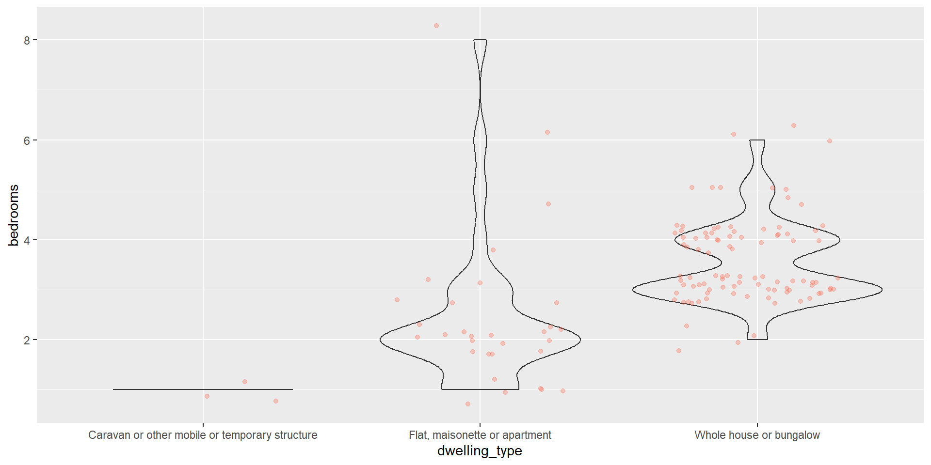
ggplot2
![]()
ggplot2 is a package (included in the tidyverse) for creating highly customisable plots that are built step-by-step by adding layers.
The separation of a plot into layers allows a high degree of flexibility with minimal effort.
ggplot2 layers
<DATA> %>%
ggplot(aes(<MAPPINGS>)) +
<GEOM_FUNCTION>() +
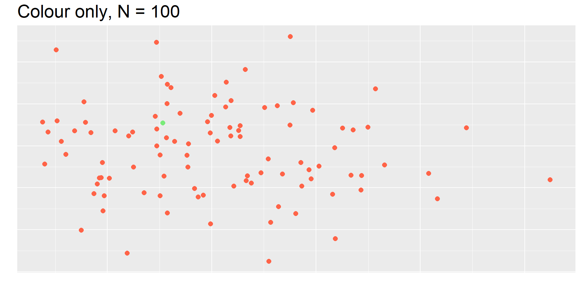
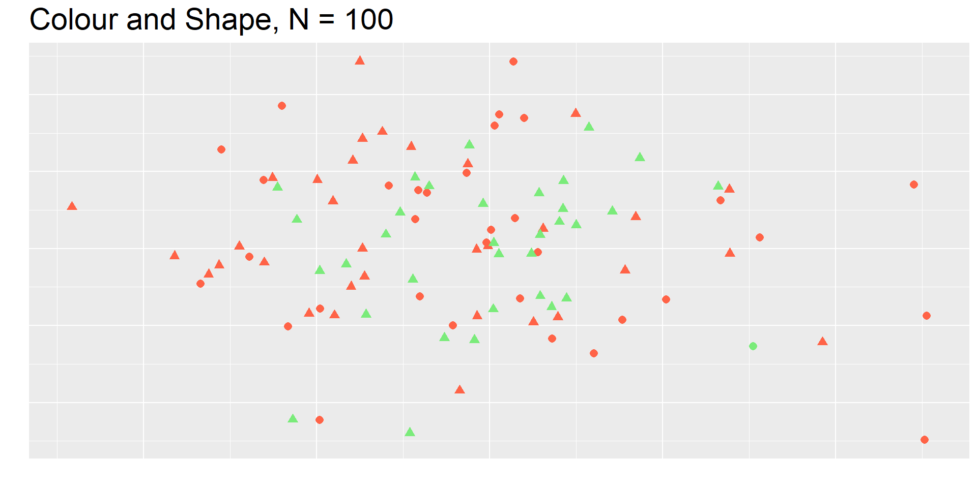
<CUSTOMISATION>Find the green dot lvl. 2️⃣
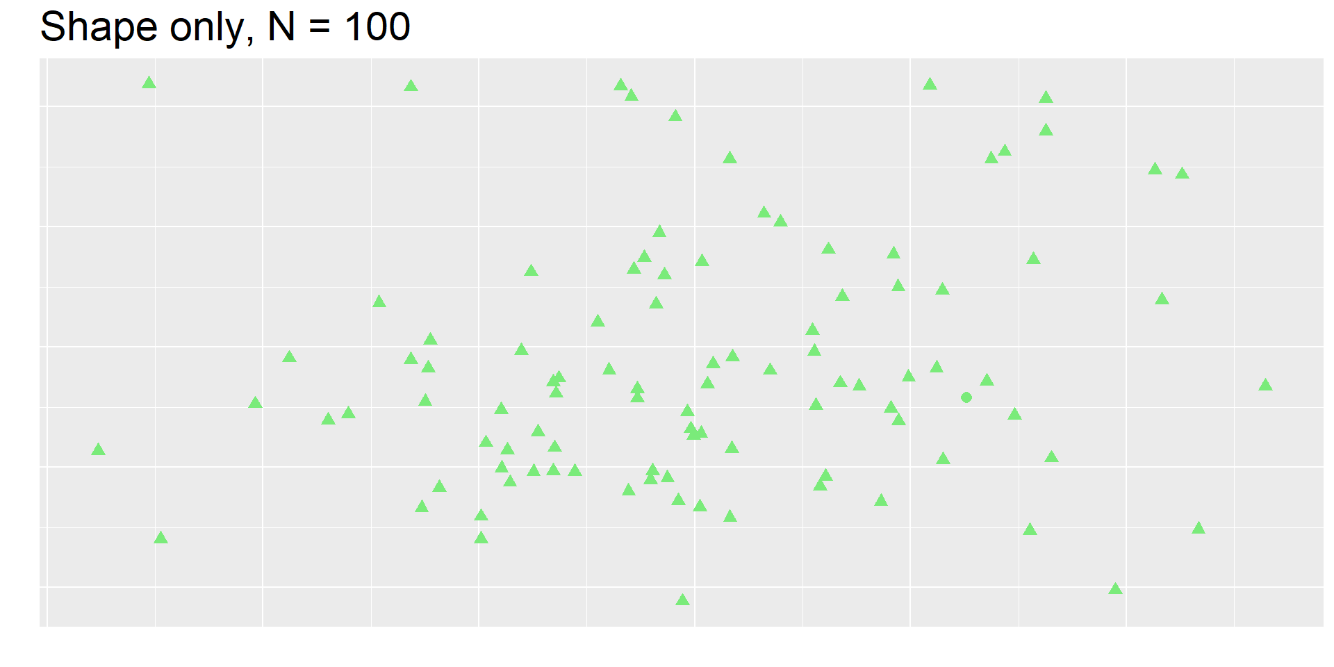
Find the green dot lvl. 3️⃣
Colour considerations
In the previous game, people with the most common type of colour-blindness would have struggled to perceive the colour distinction 😱

Viridis palettes
Are colourblind-friendly…

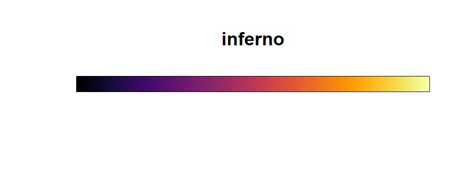
… and they’re very pretty 😍✨
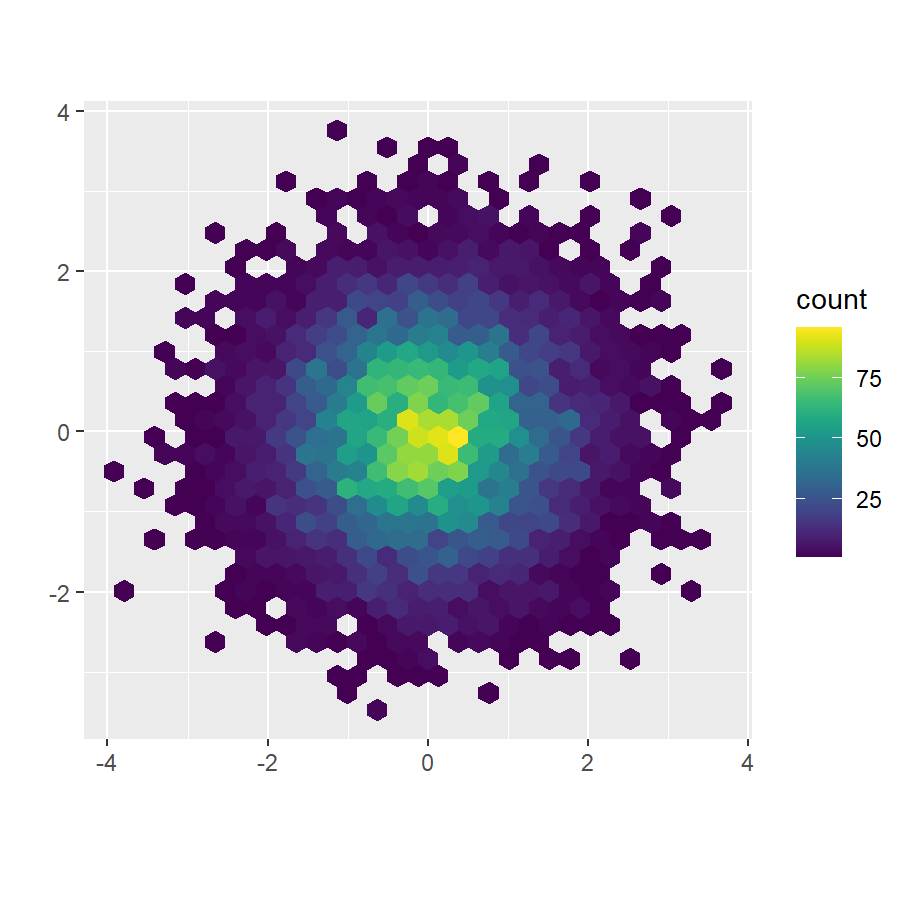
Exercise 4.1 solution

Exercise 4.1 solution (viridisLite)

Exercise 4.2 solution